ICAN’s Legal blurb : https://icandecide.org/press-release/exclusive-ican-obtains-critical-moderna-covid-19-vaccine-lot-information/
My last few articles:
ICAN's Moderna Lot# Tranche Analysis!
In the hopes that Bigtree, Siri and the team mention their huge FOIA score of Moderna LOT# and their lot sizes, varesaware.com has gone in and done the calculations and created a nifty pdf and downloadable excel spreadsheet for your consideration and continued analysis.
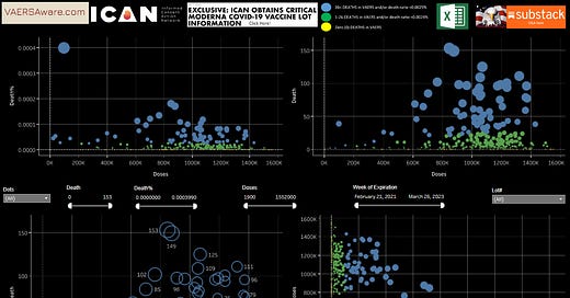
So in the style of the “Denmark Hot Lot & Placebo Lot Study”, I created my own scatter plots for ICAN’s Moderna Lot/dose information. I’ve looked at the data from all directions and that pesky Puerto Rican (PR) lot# 032H20A keeps coming up!
In above scatter plot the size of the circle is determined by the death/dose ratio… In this case our PR lot has 39 deaths to 97,700 doses. Evan assuming that every single dose went into a arm, that is 1 deaths for every ~2,505 jabs. The official number is actually 40 deaths with 25 coming from Puerto Rico.
I won’t even mention the couple deaths that have been deleted from from this lot, but one of them being this victim from Tennessee at ID# 1271332, but let’s move on to the next scatter plot…
In this visual you can see based on lot expiration date the older lots look more toxic? Now with my expert eye watching “new” reports being published week over week, I realize studies like this are somewhat arbitrary considering how throttled (delay in publication) these reports are getting? You can see just in this last VAERS update yesterday Jul 28th, there was 600+ reports that were submitted to VAERS over 900 days ago, but just published yesterday? Heck not to beat a dead horse that is the Denmark study, but there were 15 reports published yesterday that were either green or yellow dot lots….
6 of these 15 reports are yellow dot lots and considered serious events (Perm Disability, life threatening, or hospitalization). I wonder if the Denmark study had to give a pass like I did to report ID# 2657219 ? A cerebrovascular accident is basically a stroke or clots in the brain. It’s the same symptom VAERS put on my uncle’s report and he’s permanently disabled now. It’s a serious adverse event, but if boxes are not checked off or if boxes are scrubbed off, then it becomes NONE OF ABOVE aka not serious or safe & effective to the casual observer. This con game is so evil!!!
My stuff may not be as buttoned up or peer reviewed as the Denmark study or those other studies in Journals, but who needs p values and educated guesses when you have an interactive dashboard that could do better than just finding a needle in a hay stack. Here at vaersaware.com we can find a certain needle within a stack of needles! I’m your huckleberry. God Bless. Please support The Eagle. Rev 8:13


Albert, this is great. Ca you make same graphs looking at all AE or all SAE including deaths? That would make it comparable to the Danish graphs.