In the hopes that Bigtree, Siri and the team mention their huge FOIA score of Moderna LOT# and their lot sizes, varesaware.com has gone in and done the calculations and created a nifty pdf and downloadable excel spreadsheet for your consideration and continued analysis.
You will notice I took the liberty of adding the Lot# expiration dates which were not included in ICAN’s FOIA data, but since we have all the exp. dates this is what I call the synergy we bring.
Also to authenticate all Moderna Lot expiration dates just go to Moderna’s lot expiration date look-up site here, https://modernacovid19global.com/vial-lookup#vialLookUpTool.
The viewable PDF and downloadable Excel Spreadsheet is at: https://www.vaersaware.com/siriican-s-moderna-lotsdosdata
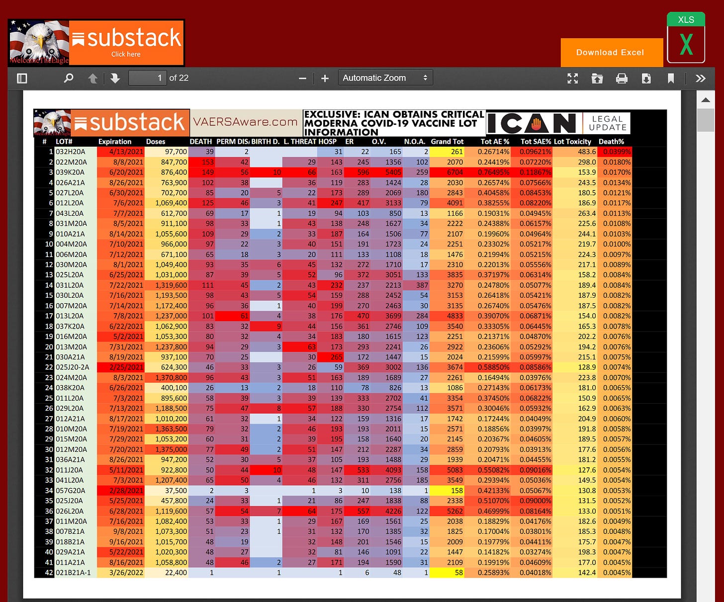
This is what you’ll see:
The Disclaimers:
There are 310 Lot’s and the pdf is twenty-two pages. I organized the lots in three different ways and the last page has additional disclaimers, like needing to omit about 250,000 VAERS Moderna reports from analysis because they either had a BLANK LOT (empty field), or lot# stating UNKNOWN, or the lot# was not apart of this ICAN tranche. The super majority omitted was for blank and unknown lots…
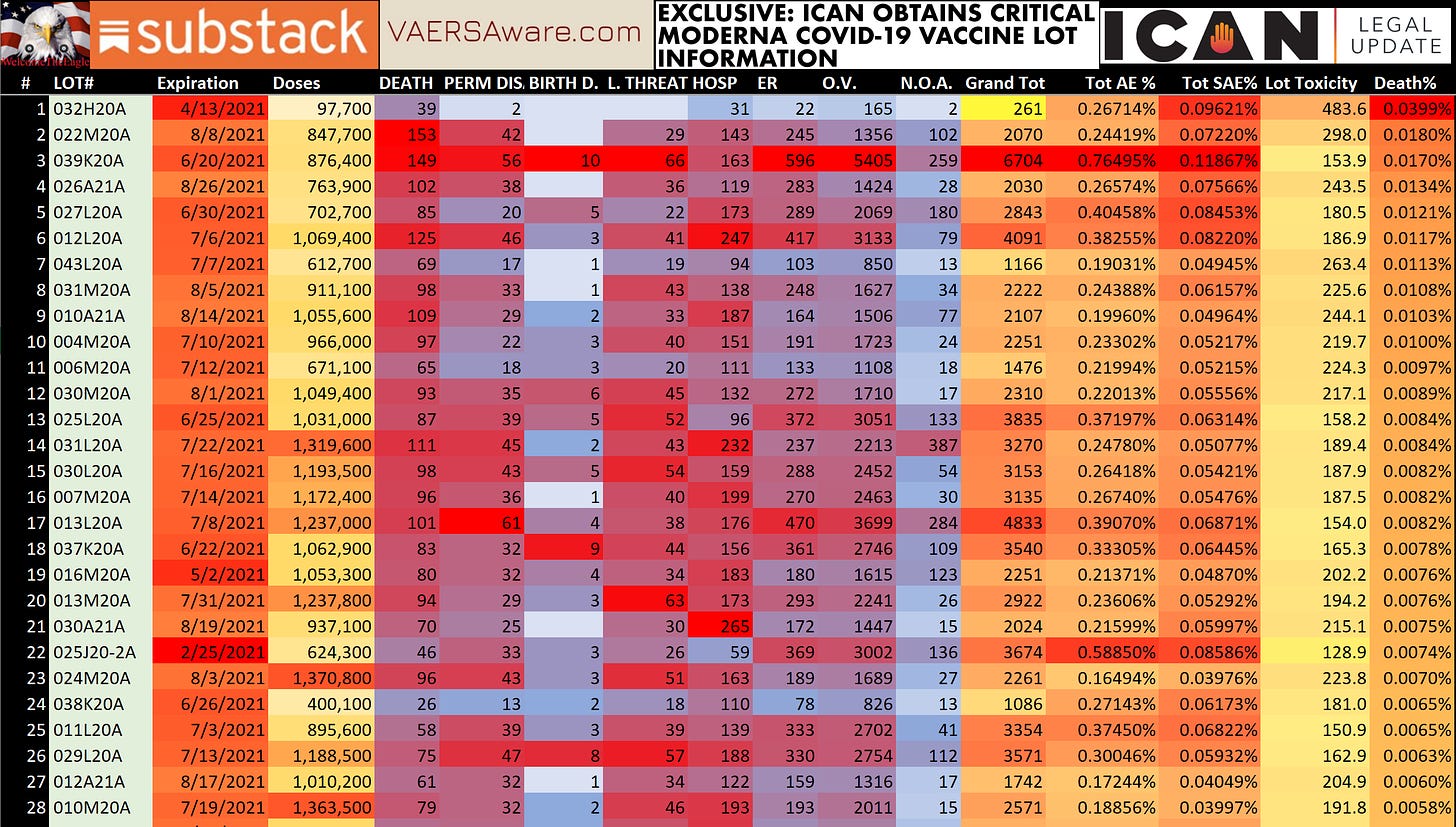
Organized by Deaths to Doses ratio which is the last column you see in the image above.
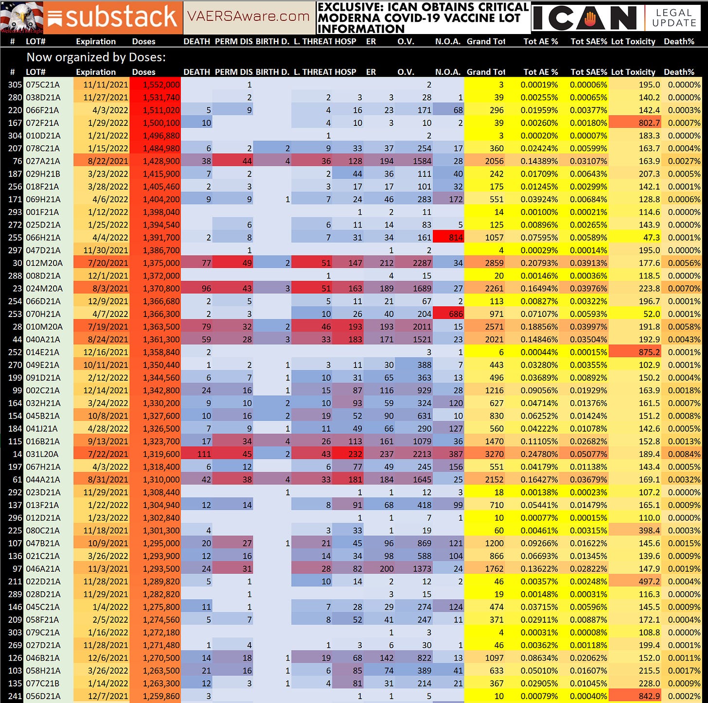
Organized by Doses which is the 3rd column as seen here:
This is a good time to explain all the little heatmaps and color coding going on in this eyesore. Each column has it’s own “heathmap” dark to light based on high to low or oldest to newest expiration dates. The column titled Total AE% is the sum of all eight event levels divided by the doses column. The Total SAE% is only the five event levels above Emergency.
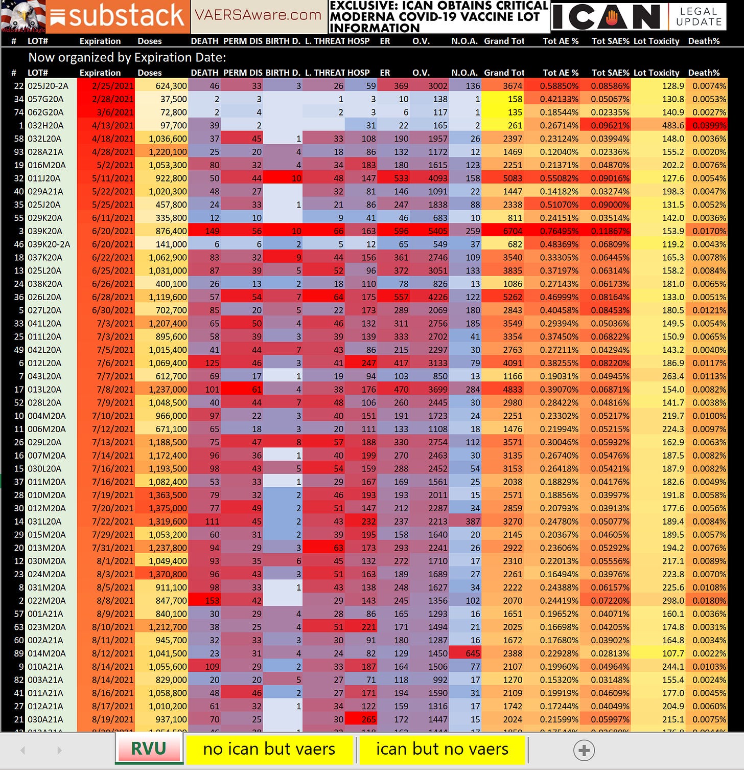
Organized by Expiration Date:
You can see at the bottom here I’m showing you the two other tabs apart of the spreadsheet which have details about some very sizable LOT# that are in the ICAN report but have zero reports in VAERS? As well as the LOT#’s in VAERS but not in the ICAN tranche.
Conclusions and observations:
Everything is much smoother on a laptop or desktop as opposed to a mobile phone, I’m still trying to polish the mobile side up as much as possible. For me I’m noticing my own Relative Lot Toxicity RVU which is always the second to last column now looks a little goofy places because it was simply calibrated to the SAE/AE : Cases ratio without knowing any lot sizes or doses administered?
Doses administered is the final caveat, we still do not know how many doses went into arms we only know the lot sizes as per this data dump from the CDC. We are not technically sure if all these doses were shipped or how many dried up in a warehouse somewhere? Many of the newer lots based on expiration date look very small, was that because of demand and supply or were these lot#’s still being shipped out when this snap shot of data was handed over to ICAN?
It’s impossible to know the exact details and what the charlatans at the FDA/CDC are doing, but one thing is for sure, vaersaware.com is on it for now. Our dashboard can tell you how bad your batch was, and it can show you “hot lots” coming on the horizon! It’s sad the Jim Jones kool-aid drinking pro-vaxx community is not the clientele using the dashboard and my website.
Please support The Eagle! Please consider a paid subscription and pay it forward for those that can’t afford to. My hope is that you can share the links and pages my website to the folks who are still drinking this deadly kool-aid and worse, giving to the kids. God Bless Rev 8:13


