Did ICAN Inadvertently Give Us A VSAFE Lite Dashboard?
First ever deep dive into ICAN's VSAFE Dashboard
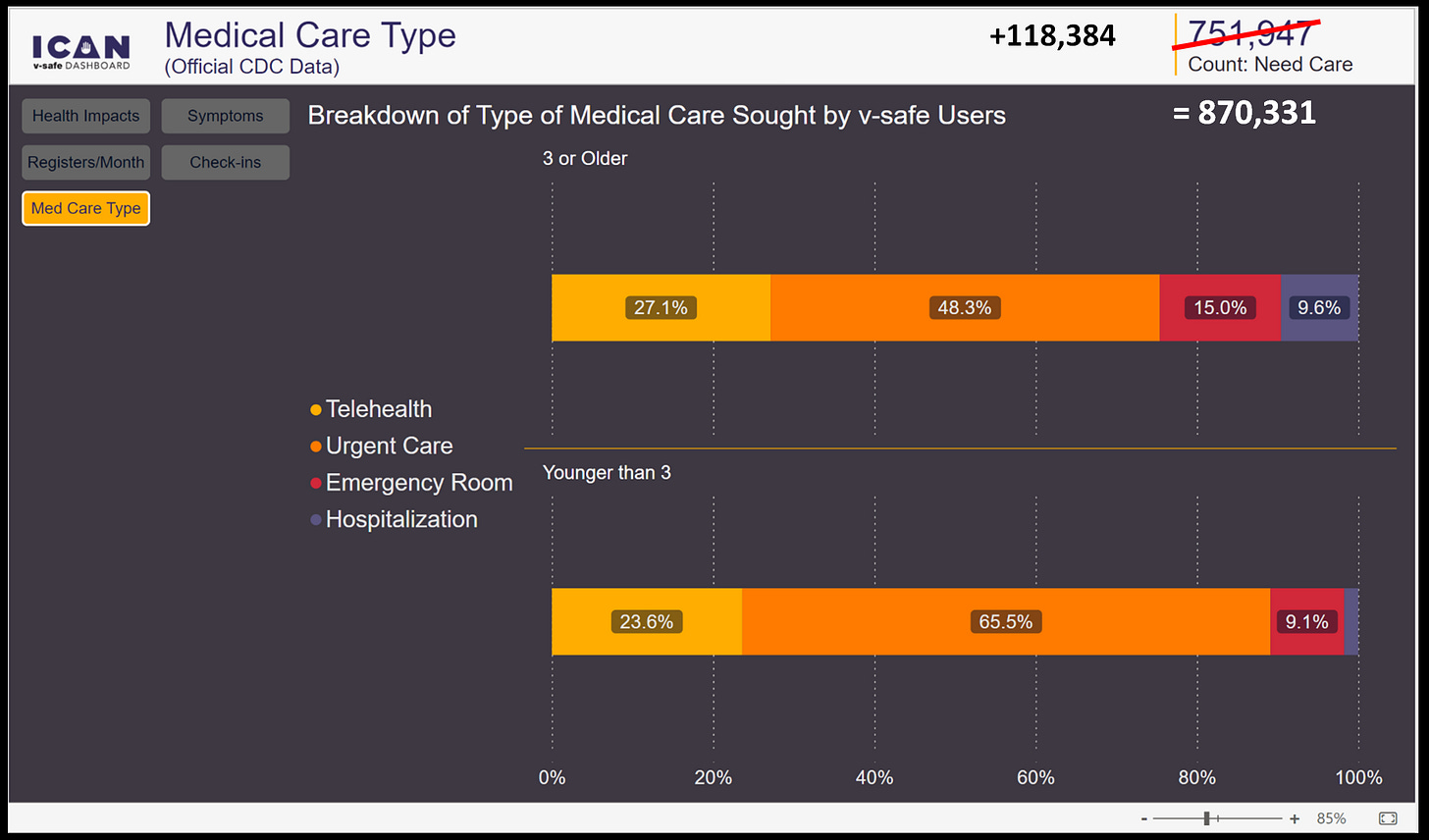
Health Impacts (~3.35M) and Medical Care Types (~751K) is where I wanted to start at in this VaersAware audit. These are two areas where ICAN did some data modeling, you can think of it as summarizing the unique descriptions into general categories.
The raw Medical Care Types actually looks like this in the downloadable files:
The raw Health Impacts actually looks like this in the downloadable files:
Now you can see how ICAN modeled or summarized the data to get cleaner visuals on their dashboard. It looks pretty harmless and a good call, although as I’m raking through the data I’m noticing a small blind spot where missing school is indicative of children, adolescents, or dependents. I suspect the reports combination of school and not under 3yrs of age and not a dependent is indicative of a young adult or college age participant? Oh well since ICAN dashboard doesn’t even have a filter for “Relationship”, no one can even see the 172,942 kids/adolescents, so I’m ahead of the game.
I hate throwing ICAN under the bus about access to the relationship filter all the time, but it’s beyond me why they haven’t included it yet? Otherwise the world is rolling with only the 13,963 kids under 3yrs old revealed in the Age Group data column.
We now have almost all the variables except the 142,859,785 check-ins generated from 10.1M participants.
In theory if you were a good participant you would have checked in a total of 16 times for each interval. At two weeks you would have checked in every day for the first week and once on the 14th day = 9 times. Then once a week for the next 4 weeks, then once every 3 months for a couple cycles, finally one final time at your 1yr anniversary.
In theory 10,108,273 participants multiplied by 16 check-ins = 161,732,368. That’s a difference of close to 18.9M check-ins that were missed or not completed for some other reason. I think I have a reasonable explanation that will be demonstrated better when my VSAFE dashboard is ready to go live (once again). Another question this auditor has and searching for is what happens to a participant that gets the next shot during this one year survey period? I’m not seeing ID#’s that would have this unique co-mingling of Survey Static ID combinations? Anyways, ICAN did some more modeling (summarizing) within the Survey Static ID Interval data a.k.a. the check-ins.
Here is how the un-modeled intervals are really classified:
There is actually 185 unique interval classifications or at least there should be, but this is when I discovered there are no kids under 3yrs with a 4th or 5th dose as illustrated below with yellow cells meaning NO participants in those categories.
A good example to help you wrap your mind around the interval buckets are at cells J4 & K4. These are yellow cells or NO kids under 3yrs with 1 dose at 3 & 6 month intervals, yet there are participants in the 12 month bucket. To clarify a white cell means there ARE participants in those categories. This means what few kids under 3 yrs there were missed their 3 & 6 month interval, but at least some of them checked-in on their final 12 month interval. Side note: strange anomaly at the 21 day interval where Novavax is introduced and some AstraZeneca/Moderna combos, etc…
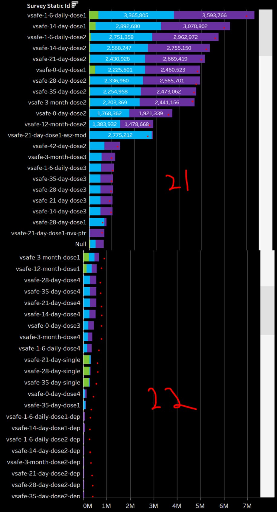
Disclaimer: I went back to the drawing and I’m reconstructing my VSAFE dashboard. I got pretty close but then understood ICAN’s dashboard a little better and found myself in a pickle right in the middle of building my rocket ship. Pretty close means I packed on 120,636,179 check-ins before the engine blew up on me! I was pushing to hard and performance penalties became to great. The dashboard became so slow and one of the graphs I wanted was not working properly. I managed to get a couple screen grabs before I blew it up and started over.
This view I was testing out a few graphs with various “stacked” histograms by age, by unique interval, and relationship. The graphs are ugly because there are so many check-ins with absolutely NO Medical Care Type a.k.a. “NONE GIVEN”. That’s where ICAN is showing ~751K check-ins out of 143M that actually records needing physician interaction (Hosp, ER, Urgent Care, Telehealth).
Huge discovery that pokes another hole in ICAN’s Dashboard:
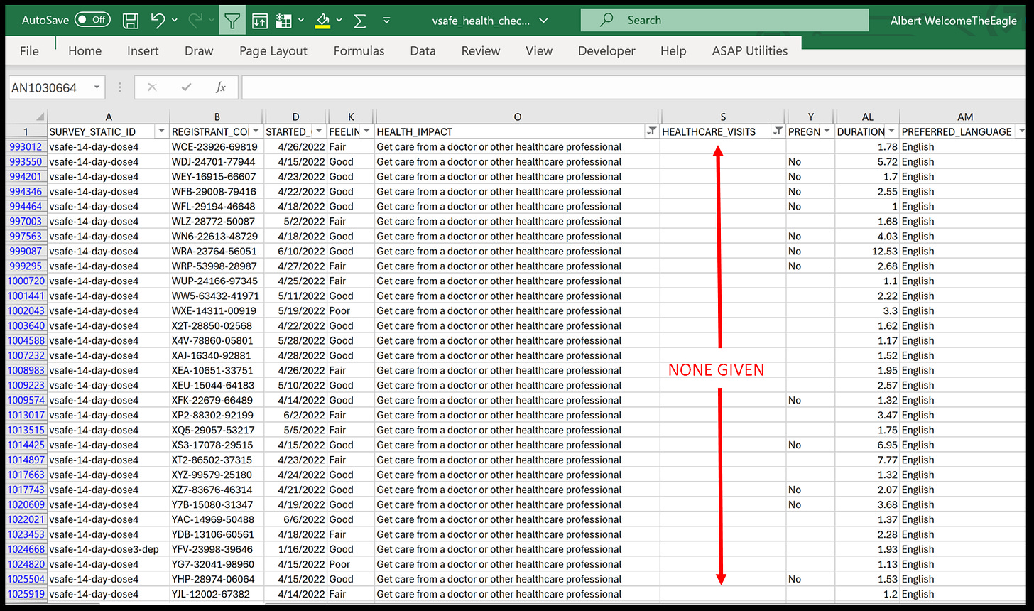
It turns out filtering first on Medical Care Type “None Given”, but looking at Adverse Health Impacts, there is a lot more participants that recorded needing help from a Healthcare Professional!!!
Keep in mind I was only looking at 120M out of 143M check-ins in the image above, so ~118K participants with absolutely no mention of a Healthcare visit could be a low or high watermark, I won’t know for sure until my dashboard is completed.
So what I’m saying is ICAN’s dashboard for Med Care Type may be skewed by as much as 15% or those 118K because the data is not perfect. This is not a knock on ICAN or their tech people, it just is what it is…
It’s for this reason I decided to go back to the drawing board and apply some of the same techniques I’m doing for VAERS. This is basically creating the filters or functionality to toggle between the original data and the ethically cleansed (modeled) data to view both sets of data. In this contrast we could see what the data looks like that was given to us, versus what the data should look like with a little ethical cleaning and corrections.
For the doubters and nay-sayers here is my proof in the raw data of this oversight or anomaly.
More to follow soon. the next tranche of 390K free text records should be dropping soon so we should be able to get a real good look at how everything is really connected and see it from the VaersAware VSAFE dashboard! God Bless.


The racial disparity vis a vis White people impacted confirms two hypothesis, one that this was targeted Racially via ACE-2 receptors. And since the preponderance of the CEOs and Chief Scientists at these companies are members of the most anti-White group on the planet, there may have been multiple malice aforethoughts.
Excellent work