Did De-pop Shot Hit Red States Harder Than Blue States? (Part 2)
The real deep dive thanks to my man John Beaudoin Sr.
Part 1: HERE
I hope this list doesn’t burn your eyeballs, but my man John Beaudoin Sr. (JB) gave me some inspiration and threw down the gauntlet. Here was his response in the comments section of my part 1 article.:
Ok so back to the burning eyeball tabular rank list, it’s ranked and keying off column I aka the state population uptake by people that received at least one dose as per Our World in Data (OWID) and divided by the VAERS DEATHS in column G.
Death per million (column J) is normalized to the population with at least one dose in column F.
Now you can state ranks in column B & C, by either absolute population or population with at least 1 dose. Notice how is does not change much, but somebody like Idaho jumped from 54th to 40th when only the population with 1dose< into consideration?
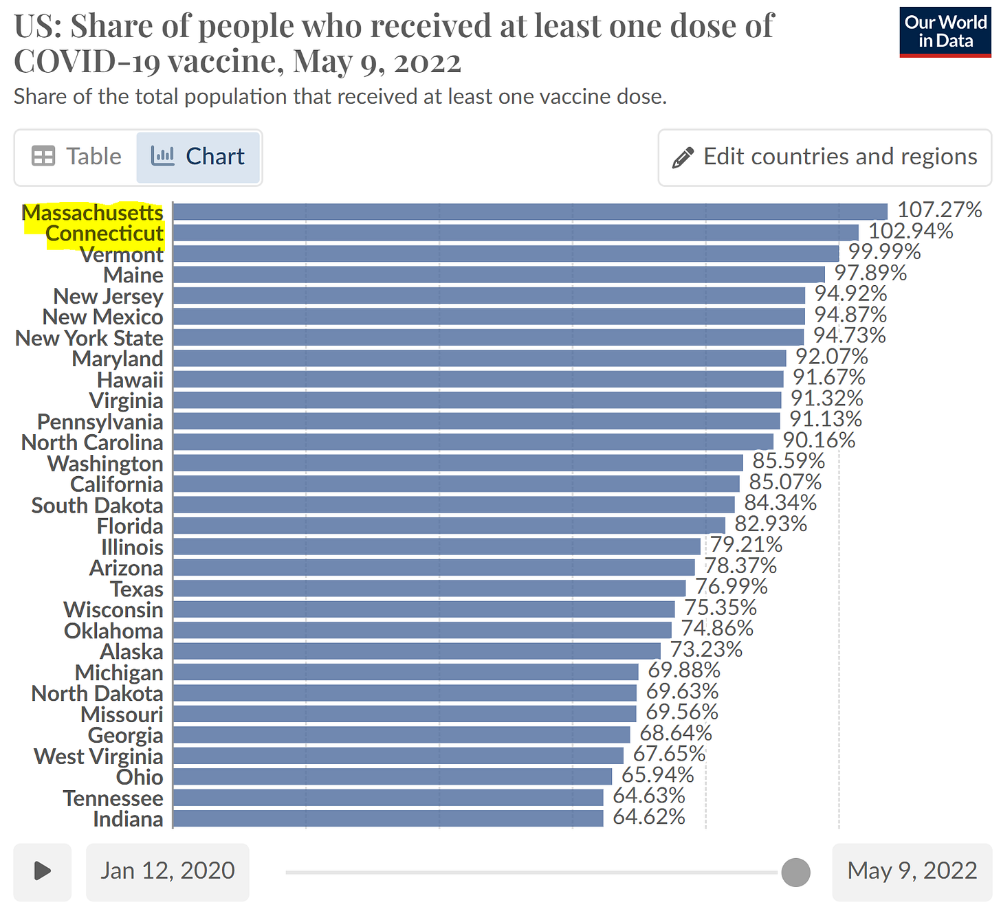
Now what is interesting is column L from OWID telling us the % of doses per 100 people, which is like saying this is the average of how many doses each person received. OWID is saying South Dakota lab rats received 190.92 per 100 people or aka ~1.91 doses per person. However when in “validation” in column M which is Total doses administered divided by people with 1dose< it shows people on average received more doses than what OWID is saying? I tried to figure out what OWID was measuring against and the statistics are much more agreeable they measured administered doses against the absolute state population census? There was not much details to go off except this little blurb in yellow.:
When looking at the heat map in my validation column M, it makes much more sense than the heat map of OWID’s data in column L.
Now I think we can see a little revelation to what JB found strange about MN, WI, MI sitting so high up the list at 6,7,8. I’m sure all those peeps are fine church going folk, but they are also the most jabbed up folks in the nation with Minnesota clocking in at #1 with the most jabbed up Kool-Aid drinkers 2.88 jabs per person of those that received 1dose<. Wisconsin is #2 in the nation at 2.84 jabs per Kool-Aid drinker.
My last column N or the population with at least 1dose< is a bit strange because there are some states going over 100%? It’s strange but it’s also strange in OWID’s as well. Here is my comparison against OWID:
I think the discrepancy and X factor here is that I’m using a 2021 population census and OWID is using a more recent list? The other possibility is that the CDC and the government can’t seem to keep all their lies straight?
Now here is why I am The Eagle!
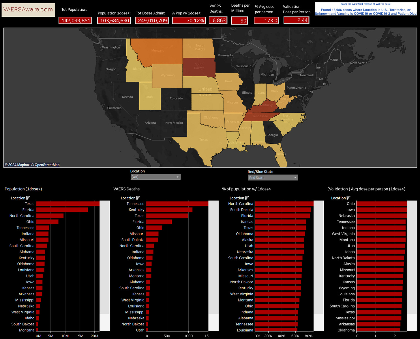
I created this interactive dashboard for even deeper perspectives and visualizations.
The color motif should be self explanatory, and the other cool thing about dashboards are the “tool tips” or the additional helper information you get by hovering over a state on the map or pointing at a histogram bar.:
I still need to fill out the tool tips with more info, but you get the idea. Now let’s check out what just the red states look like.:
Now the blue states.:
Maybe you want to mix and match states based on a hunch or theory you have, like considering Georgia a red state because it was basically stolen and flipped blue last election.
One thing I’m already seeing and tough to explain away is that blue states had more people, more doses administered, more doses average per Kool-Aid drinker and yet collectively blue states have more than 800 fewer deaths than the red states. This NY & CA anomaly just puts a big ugly fly in the ointment. It’s reminiscent of the big staged mass Covid death event in NYC April 2020?
Anyhoo, JB laid down the gauntlet and I pirouetted and smashed it back to John. Can’t wait for JB to take a carpet ride in this new dashboard and feast his engineering eyes on all the visualizations. The excel spreadsheet version of the data is on it’s way John Beaudoin, Sr. Book it Danno and write her up!
New cool dashboard:
https://www.vaersaware.com/owid-vaers-deaths
Please sign the Federal Investigation Petition:
https://www.vaersaware.com/fedinvestigation
God Bless and please support The Eagle!


The table by Jessica Hockett you posted only includes deaths from March to May 2020: https://pandauncut.substack.com/i/138487782/unexpectedly-high-mortality-in-younger-adults.
Hockett's table shows that in ages 25-54 in 2020, the number of COVID deaths was 1,937 in NYC and 5,704 in the rest of the US, so NYC made up about 25% of the US total. (You combined the table with another plot that only included deaths in hospital inpatients, but I think the table you posted also included deaths in other settings.)
When I searched CDC WONDER for deaths with underlying cause of death COVID (U07.1), month of death March to May 2020, and county of residence one of the 5 counties of NYC, I got 1,886 total deaths. I don't know why it's lower than Hockett's figure, because when I switched to multiple cause of death COVID, the number of deaths increased to 2,028 which was higher than Hockett's figure. But it might be if Hockett got the number of COVID deaths from NYC Health instead of CDC WONDER like the caption of the table seems to indicate.
But anyway, when I extended the time scale at CDC WONDER to the whole of 2020, I got 1,651 deaths in NYC which was about 9% of the number of deaths in the rest of the US. And from 2020 up to the present, I got 2,658 deaths in NYC which was only about 3.2% of the number of deaths in the rest of the US. But according to the population figures cited in Hockett's table, the population of NYC aged 25-54 was about 3.1% of the rest of the US population aged 25-54, so in ages 25-54 in 2020-2024, the total COVID CMR was close to the same in NYC and the rest of the US.
NYC got hit by COVID earlier than the rest of the US, but contrary to Hockett's claims, NYC didn't have an unusually high percentage of COVID deaths in young age groups out of all ages: sars2.net/nopandemic.html#Claim_that_New_York_City_had_an_anomalously_high_number_of_deaths_in_younger_age_groups_in_spring_2020. In fact the percentage of COVID deaths in ages 0-54 out of all ages was much higher in southern states in 2021 than in New York State in spring 2020.
In the red states that had a low percentage of vaccinated people in young age groups relative to all age groups, there was also a high percentage of COVID deaths in young age groups relative to all age groups.
In 2020-2023, the total COVID CMR in ages 25-54 was about 20.6 in NYC (3162/3838849/4*100000). But it was over 20 in most states in the southern census region, and the highest CMR was 43.1 in New Mexico (from 1348/3128270*100000 using CDC WONDER's population figures).
Never forget VAERS #1872793 aka the report from Gilroy, CA where the reporter, Mike Granata's wife exposed the cover-up of hospital staff to report to VAERS...