


Does you all remember that assertion that red states were being hit harder with Covid-19 vaccine injuries than blue states?

Back in the day and based on the VAERS data it sure looked like red states were under attack more than blue states. The money shot in my video above was this image below where I did a side by side of The Exposé money shot (right) and mine on the left. For the record, it was the The Exposé that first broke the story of “hot lots” around November 30, 2021 but it was the work of Team Enigma aka Craig Paardekooper and Sasha Latypova. Craig as know is the creator of howbadismybatch.com. Sasha found me in some random Telegram chat group shortly after and the rest is history as they say…
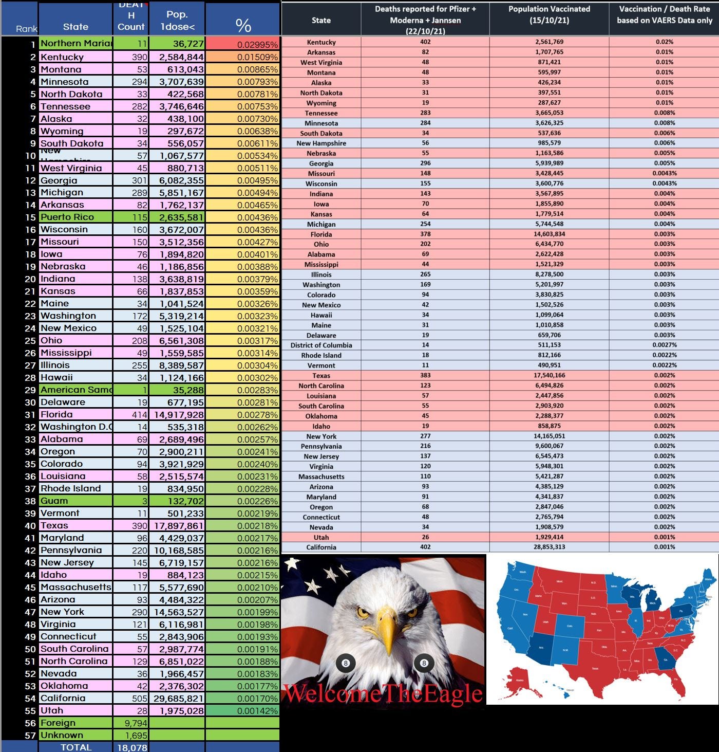
You can also see that I added US Territories into the my calculations, because the United States doesn’t like to poop and eat in the same place. We punted a few toxic lots to the Marianas and Puerto Rico including the most toxic lot in the entire VAERS universe Moderna lot 032H20A to the Puerto Ricans. My disclaimer here is this analysis was only looking at death reports in VAERS and nothing else…
So what does the new landscape look like with six additional states being flipped red (Republican)?


One glaring factoid I want to highlight is that as of late November 2021 there were 18,078 deaths captured in VAERS, today almost 3 years later there is officially “only” 19,104 domestic deaths. I won’t get into my opinions, just to say we are getting a heavily curated version of the truth! 1) VAERS DOES NOT PUBLISH ALL LEGIT REPORTS RECEIEVED. 2) Deletes legit reports (after publication). 3) Throttles reports (purposefully delays publishing reports).
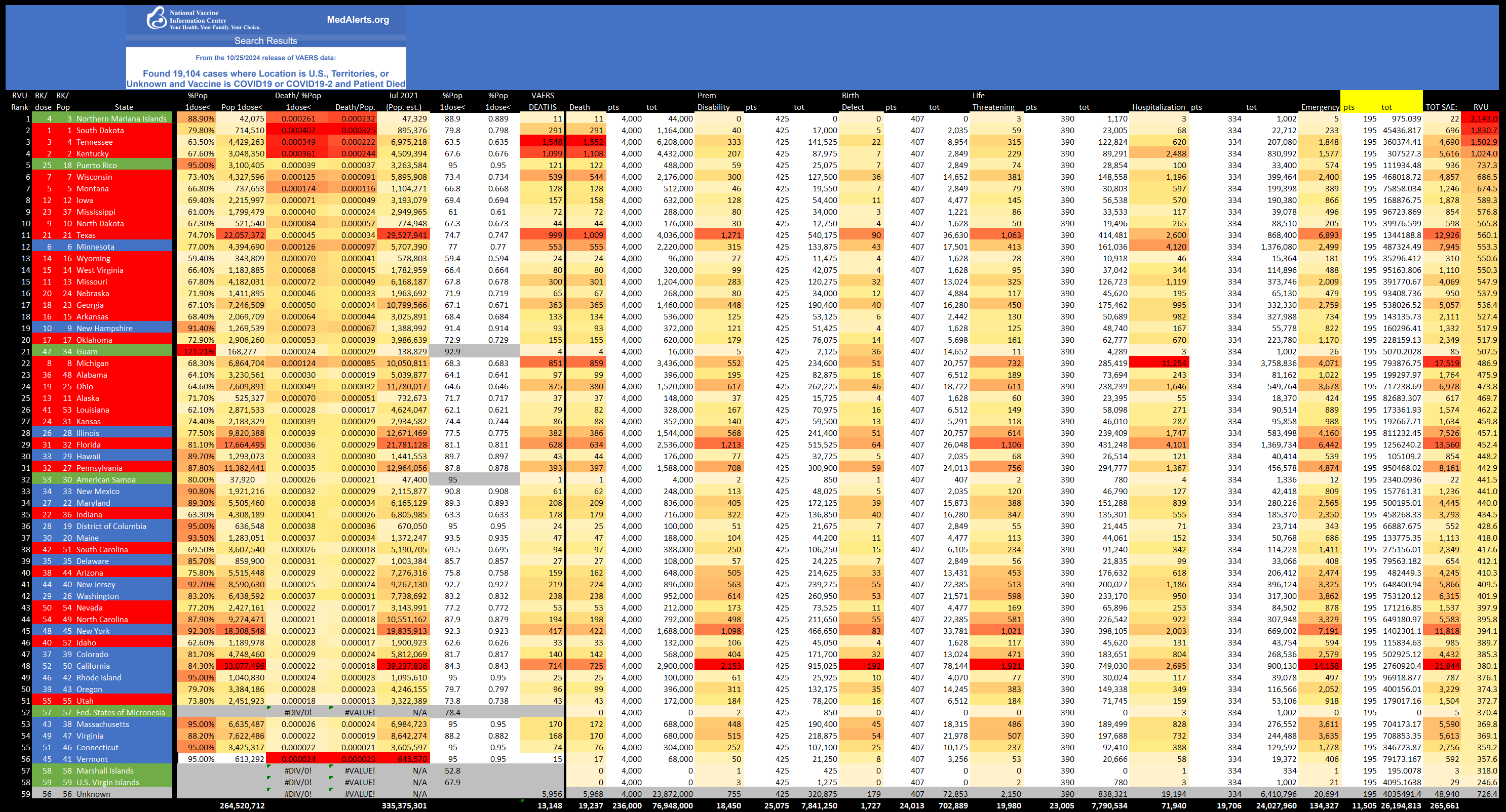
This is a good time to re-introduce a more sophisticated version incorporating the other severe events, along with my ranking system. Coding each report to ultimately specificity and assigning a relative value to each report by it’s most severe event. There was many factors and calculations that went into my RVU (relative value unit) formula but it condenses down to this:
Death = 4000pts
Permanent Disability = 425
Birth Defect = 407
Life Threatening = 389.9166
Hospitalization = 334
Emergency = 195.0078
Correlating and tabulating states to my custom RVU I now present this graph for your consideration:

Disclaimer: There is an additional ~8,200 reports included over the official counts, these are UNKNOWN VAX TYPES and manufactures I have identified as actually being covid-19 jabs.
I think my rank can become even better factoring in states population size and even population with at least 1dose<, but it won’t change much so I think it’s very acceptable for this little blog. The general observation I want to point out here is how top heavy the red states are.
I’m open to suggestions on a better formula and can give my raw data spreadsheet to anybody that asks and wants to run with it. God Bless

BTW: Here is a peek into my raw spreadsheet:
This doesn’t count all the deaths that were not attributed to the vax but were most likely caused by it. My ex died from bilateral embolism and enlarged heart (cardiac arrest on death certificate).
He had four Pfizer shots but it was about seven months after the last booster that he passed. We paid for an autopsy and he had multiple blood clots in both legs as well as his lungs. In Texas, but he voted for Biden.
I find it interesting that since President Trump won the election, they have really ramped up Chemtrailing in AZ. MT too. Got to kill those darn Republicans one way or another!