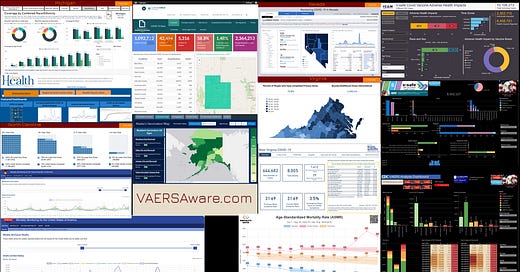
Click image for tutorial video.
As it stands there is only one official Adverse Events Reporting System also known as CDC’s Wonder System. The “Wonder” is a cheesy acronym for Wide-ranging ONline Data for Edpidemiologic Research and there are actually many reporting systems within. It provides access to a wide array of public health info. Weather it’s completely accurate and maintained with utmost integrity is entirely a separate matter. The VAERS system sure isn’t, but it’s the best we have and the best the world has. Don’t throw the baby out with the bath water however, the data that is getting published is similar to a salmon spawn. Like any baby animal out in the wild making it to adulthood, consider it fortunate in todays environment of data suppression and obfuscation. Anyhow here is the link to all the other reporting systems within WONDER.
Since the rollout of the newest depop shot vaccines, many other sites including my own have come onto the scene to make sense of the VAERS data. The Godfather however is Dr. Steven Rubin aka MedAlerts aka NVIC.org. How Rubin hooked-up with NVIC is a pretty cool story, you can begin to get into it here. OpenVAERS was second. These three sites are the main “VAERS” sites most of the world know and they each have their attractions which usually heavily depends on the users comfort level and aptitude with querying data. The easiest and most appealing to the eye is OpenVAERS for the general population. The more grizzled data types comfortable with querying data and wanting more elaborate cross sections of data will prefer MedAlerts. While both offer some rudimentary graphical visualizations, OpenVAERS graphs are static, while MedAlerts can generate a tailored graph base off your query and is located in the “expert mode” section. I guess you can say for the few graphs offered they are semi-static. I don’t want to forget Tim Truth and his site vaxpain.us who has a good looking easy to use site good for reading reports that have been segregated for you by categories of injury. However a fan favorite of mine and many other grizzled data folks who like visualizations and some very savvy custom views is vaersanalysis.info.
There are many more coming onto the scene and not only with “VAERS” sites or strictly vaccine injury stats. More people are starting to pulldown data sets of all sorts from the CDC and other agencies to make graphs and interactive dashboards! I’m not sure but I think there was one other VAERS interactive dashboard that rolled out before mine and that was/is the late Brandy Vaughn’s website learntherisk.org. I really like Brandy’s dashboard in that it is in the MS PowerBI environment. It looks really cool but there just isn’t enough filters to pivot data on. If It was the MS Excel environment I would have said there is not enough slicers and timelines. I tried early on to connect with this group, but it was crickets. Oh well, I’ll just build something myself! If you are into data visualization and if you sort of do it for a living then you know you’re always sniffing around for ideas and learning how to do the next cool thing. There are actually quite a few enterprise level data viz platforms like the popular ones Tableau, Periscope now called Sisense, Qlik, PowerBI, but there are more! My cousin for example who is helping build the Smart City in Buenos Aires (unfortunately) uses Qlik. So yes, something like that is as enterprise as it gets. However did you know in August 2019 Salesforce acquired Tableau for $15.7B here? It’s not Twitter $$, but at least 3-4 NFL teams? Most of you probably never heard of Tableau, but I guarantee you probably use something on your mobile phone everyday that is in part using Tableau. Have you ever thought of your phone as being one big dashboard?
Ok let’s stop gilding the lily and without further ado, I went on the hunt for dashboards geared towards vaccination data, with that I found many state level health departments using dashboards and primarily using PowerBI or Tableau. I have at least Michigan, Nevada, Alaska, Oregon, West Virginia, Virginia, North Carolina, Utah and California. I found Ben’s USMortality site, and Fabian’s PerVAERS site. Both Ben and Fabian have a connection with Germany so I included those dashboards too. If anybody comes across a interactive dashboard you think I might like send it my way! I will put up a few county dashboards like Santa Clara County and Clark County aka Las Vegas. I think ours here in Santa Clara County is the best dashboard I’ve seen for counties. I not opposed to going bonkers and go after all the counties in America, but I don’t know how much that really is? Sadly it’s not that many IMO. Click the image I lead off with to watch a quick tutorial, this is the link to dashboards HERE. Full disclaimer: dashboards work best on a laptop, the mobile and tablet version sucks for my standards, only the Tableau dashboards are passable on a cell phone. Be patient for the first 30 seconds and let the page load up. God Bless


Great post!